Titles and covers…
I’ve written about this topic many times before, including in my little course “Writing Fiction” (a free PDF download—see my “Free Stuff & Contests” web page). As the years pass, I always seem to come up with something more to say about it, so here goes:
 I’ve seen some really bad titles and covers. Traditionally published books often have traditionally bad covers more akin to what a high school kid might produce using PowerPoint. (I guess the Big Five publishing conglomerates would be among the first to not want readers to judge one of their books by its cover. I rarely do.) Traditional publishers do a bit better with their titles. (Or, they pay more attention to their authors’ wishes, even if they aren’t the privileged old mares and stallions waiting in their stables to go to the glue factory.) They (or again, their authors) often blow the title as well, though. (Whether you like Sue Grafton’s “alphabet-soup series” or not, her titles were very boring and mundane; and Gone Girl and its imitators are laughingly silly and forgettable.)
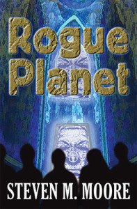
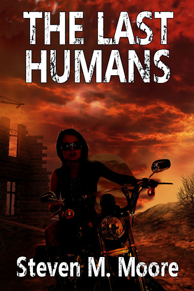
 One reason traditional publishers like print, I suppose (I insist on looking for logic even in what’s illogical!) is that hardbound books have flyleaf covers that often end up in the garbage bin (often the appropriate place for them), so their quality doesn’t really matter. Only the avid and aware reader notes the absurdity of the flyleaf on a hardbound edition. Small presses, if they publish a print version, generally only produce trade paperbacks, so they’re a bit more responsible about creating a nice cover. My three traditionally published books done by small presses, for example, have excellent covers. (There was input from me for The Last Humans, published by Black Opal—the rest of the trilogy was self-published—but that was not wanted for Rembrandt’s Angel and Son of Thunder, published by Penmore Press—as a consequence, I’ll admit that the latter two covers had to grow on me a bit. All my self-published print versions have good covers as well, thanks to cover artist Sara Carrick.)
Titles can grab readers’ attentions more than covers. I’ve just read Twenty Years Buried, a Joffe British-style mystery. It’s a second edition, so the title is also a second title, but it’s a damn good one! It immediately caused me to think of a cold case involving a skeleton and a forensic pathologist specialized in wringing details from the skeletons of old murder victims. (In this case, this was a literal wringing: The skeleton was in the river! That turned out to be a good guess of mine, because of the title, although there are many other things going on in this novel.) That’s the ideal: A short title that summarizes the plot and grabs readers. (You might think Gone Girl might be a good example of this, but that title’s too damn general. It could have been a YA novel about a teenage runaway, for example.) I think The Midas Bomb is my best title in this sense. (The cover of the second edition, whether print or ebook version, is deceptively lascivious. While it features the shapely leg and elegant hand holding the gun of the femme fatale, the novel is much more complex. Fortunately, the title does a better job of describing the plot—again, in just three words!)
 I have to confess that I have some colossal failures in both covers and titles. Perhaps my worst cover (for a very interesting story, I must say) is Evil Agenda’s. If memory serves, that was cobbled together in a hurry with PowerPoint (do what I say, not what I do!) and based on a scene in the novel. Not a bad idea really, but it needed the TLC from a graphics artist. My worst title? Perhaps Come Dance a Cumbia…with Stars in Your Hand! It’s much too long. (I like it better now after hearing that disastrous movie title Everything Everywhere All at Once, though…but that’s Hollywood for you.) In the “Chaos Chronicles Trilogy,” I departed from the very appropriate Survivors of the Chaos of the first book (the Chaos is a world-shaking event that occurs in the future) and titled the second book Sing a Zamba Galactica (not bad because it hints of a saga in just one novel). Interesting story behind that too: The original title used Samba instead of Zamba. I should have caught that error: I knew very well the difference between the Brazilian samba, a dance, and the Argentine zamba, a folk-song form popularized by Atahualpa Yupangui. I made that mental hiccup even worse by carrying that the dance theme on to the third book (although the cumbia, a famous Colombian dance, is also a song form, like the tango and many others). The title does describe the last scene in the entire trilogy well, though.
Of course, it bears repeating: Neither a good cover nor a good title will turn a bad book into a good one. Avid readers know that. They are just wrappers or window dressing for the entire package of inside material. Yet, if an author wants a completely appealing package, they will spend some time thinking about an appropriate title and cover. Not as much as the time that should be spent producing a polished manuscript, of course, but time enough to ensure that the cover and title add to and don’t subtract from the book’s appeal.
***
Comments are always welcome. (Please follow the rules listed on the “Join the Conversation” web page. If you don’t, your comment goes into the spam folder and will be deleted.)
 The Chaos Chronicles Trilogy Collection. While many parts of Survivors of the Chaos (the second edition is contained in this collection) and Sing a Zamba Galactica were originally my first efforts towards writing a major sci-fi epic, the first book in this trilogy wasn’t the first one I published. (The last novel of the trilogy was written as I developed my preliminary efforts into a trilogy.) The sci-fi universe created here appears in many other stories, including Rogue Planet and A. B. Carolan’s first three YA sci-fi mysteries. You can now read the entire trilogy—I think of it as my Foundation trilogy (unlike Asimov, my stories have ETs)—in this three-novel bundle. It’s available wherever quality ebooks are sold.
Around the world and to the stars! In libris libertas!
